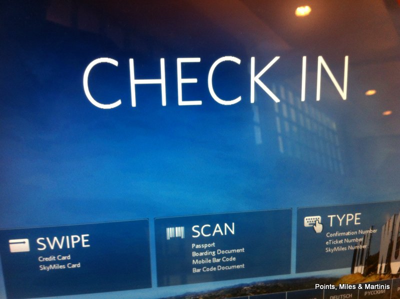
Delta has done a great job with the new self service kiosks. I checked-in this week with the new kiosk version and was surprised with the new streamlined process. The new design, seen in picture below, is nice as well.

The new kiosks have shortened the user experience by allowing the user to change only the items on the reservation they’d like to (seats, flight, upgrade, etc), or simply go straight to check-in and printing of boarding pass.
Looking forward to the new Delta website in the near future as well.
Bottom Line
I appreciate Delta’s strategy to allow the customer as much or little human interaction as desired. The new kiosks are perfectly aligned to this strategy.
I found that the check-in process time was cut down by using the kiosks. Less time spent at the self service kiosks means more time to spend in a new SkyClub or a favorite Atlanta Terminal E airport restaurant.
Have you seen or used the new kiosks yet? What did you think?
Follow us on Twitter || Like us on Facebook || Sign Up For Email || Tips & Tricks Page


Used Tuesday at CHO. Thought it was fine…changes not earth shattering.