Back when Delta upgraded their kiosks a few months ago, we predicted that Delta would roll out a new website. Now that it’s out, they’ve incorporated some slick new features but left some of the old bugs that still require workaround.
I got to play around with the new website late one night last month when the IT team accidentally went live after midnight. But now that it’s out, I’ve been looking at it for a day and overall I really like it. But it’s important to know a few tricks to avoid paying more miles for the same award flight.
New Website Looks Great
The new website design looks great. It’s easy to navigate and the feel is very user friendly.
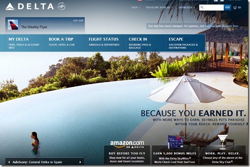
New Flight Map & Summary Of Miles Earned
I really like some of the new features like the map of future and past flights. Although it shows both future and past flights, it only shows those flown on Delta. Would be great to show flights flown or scheduled to be flown on partner airlines like Korean, Alaska or Air France.
The summary of Miles earned is pretty slick. It shows sources of Delta SkyMiles from flying or other options like hotels, car rentals and credit card spending.
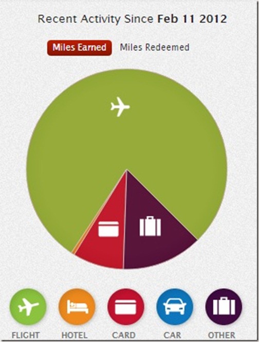
I think I fly to much. Where did all of your miles come from this year?
Old Bugs Still Exist
Even though the website has some great enhancements some of the old bugs still exist. We’ll illustrate one example and show you how to work around it so you can avoid spending more miles for an award ticket than would have otherwise been required.
In our example, we’ll search for 3 Business Class tickets from Atlanta to Paris.
First, we selected our departure and arrival cities, then we searched for Business Class availability. The first results were less than inspiring. The website returned connecting Delta options requiring 180,000 SkyMiles per ticket.
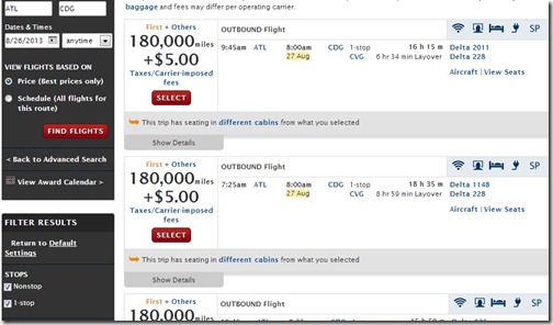
We can do better than that because Air France has a direct flight with low availability requiring only 100,000 SkyMiles per person for Business Class. So we inspected our search and realized that the “non-stop” flight option was selected as well as the 1-stop flight selection. Simply turn off the 1-stop flight selection and see what happens.
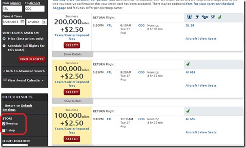
Voilà! Three Business Class tickets to Paris on the direct Air France flight for only 100,000 Delta SkyMiles, all by clicking one button.
New Tweaks Can Still Be Made
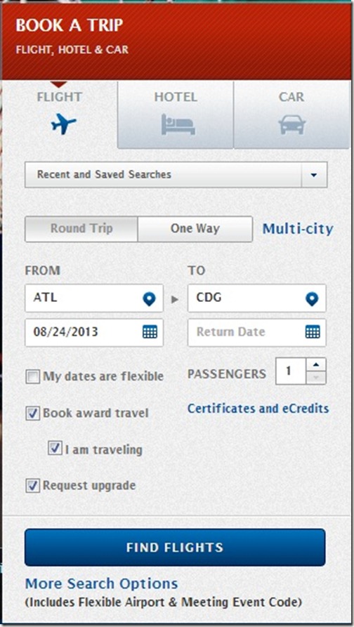
One minor knit pick that I’ve found (so far, as there are likely others) is when searching for an award from the main page. The website requires you to select additional search options in order to return Business Class award flight options.
When you enter your details for the award flight, you cannot select “Business Class” from the main page. As a result, searches will be for coach, unless you click on the “More Search Options” link.
Bottom Line
Delta’s website is a big improvement and we welcome the investment. However some bugs still exist around the award availability search.
Follow us on Twitter || Like us on Facebook || Sign Up For Email || Tips & Tricks Page


Yeah, the new website “looks great”. In reality it’s the same old tired face with new lipstick. Is it really any easier to search/redeem for Skymiles international awards? No, I don’t think so. Skip it and go to Air France, find Delta flights (to avoid the onerus fees), then book on delta.com or by phone.
Hi Shindig – Like the name by the way! Agree, the behind the scenes award booking seems the same. While there are some really nice front end enhancements that I like, it will take some time to get used to it.
You are the first person I have heard that likes the new website. It is a royal mess IMO, and the old homepage (not as fancy as the current one) was far more functional, streamlined, and easier to navigate. The new website has a few nice added features, but on whole it was poorly developed with seemingly endless bugs and compatibility issues. Not only that the background is really bogging down the speed and responsiveness of the website. It is getting flamed pretty badly on Flyertalk, and the thread is already 10+ pages long:
http://www.flyertalk.com/forum/delta-skymiles/1405858-delta-com-overhaul.html
Hi Golfingboy – I think we may be talking past each other. The point of my article is the new site looks great (nice) but old bugs still exist, and new ones (so far) have been created. Don’t see how my article backs up your points. Sorry, but thanks for reading.
Gotcha, your article seemed to focus on the award calendar and award booking system, so I assumed you felt the rest of the site was a positive change from the old one. Where I think, it is a negative change for most part mostly due to lack of proper beta testing and soft launch and focusing too much on aesthetics rather than functionality.
Earlier today at the US Club in PIT, I watched a poor soul trying to sign up for a SkyMiles account on the new DL site and after encountering countless of error messages, he finally got through the process after about 20 minutes. Then when he attempted to sign in as a newly minted DL member, the site spat 2-3 different error messages in that little pop up log-in box.