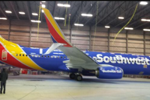
Last Monday we bogged five reasons why Southwest Airlines might be getting a new livery. This Monday there is a press conference with SWA CEO Gary Kelly at 8:30am Central time in a Southwest Airlines hangar at Dallas Love Field. Could it be all because of this 737-800?
Earlier in the evening, this rendering was being circulated …
Bottom Line:
Oh wow. Wow good, or wow bad?


Show me the vertical stabilizer and I’ll tell you…
Wow…BAD
Too bold, will not age well; the muted desert colours are a better fit in invoking ‘Southwest’. The company should have gone to a New Mexico artist/designer for a better idea. This would have been a good colour scheme for Avianca in Venezuela. Since Southwest has expanded tremendously geographically, into the Caribbean e.g. maybe a name change would have been in order as well.
I like it.
Bad. It was easy to spot a southwest plane flying above with the orange, now they want to look bland and dull like everyone else. That’s not really going to make anyone switch airlines in my opinion. It also shows that other bad changes are on the way if they are copying legacies….
I think this looks terrible. Of course, when a change happens, its human nature to not like it, just like when Delta changed to its current livery…it looked horribly bland at first. But now its sharp.
So maybe time will change the view on this, you really need to see it in person.
But I will say that with this livery, gone are the special paint schemes like the states, supermodels, etc. since those would eliminate their super graphic name on the fuselage.